
Why Technology Needs Dignity
UX Design for the 60+ Generation:
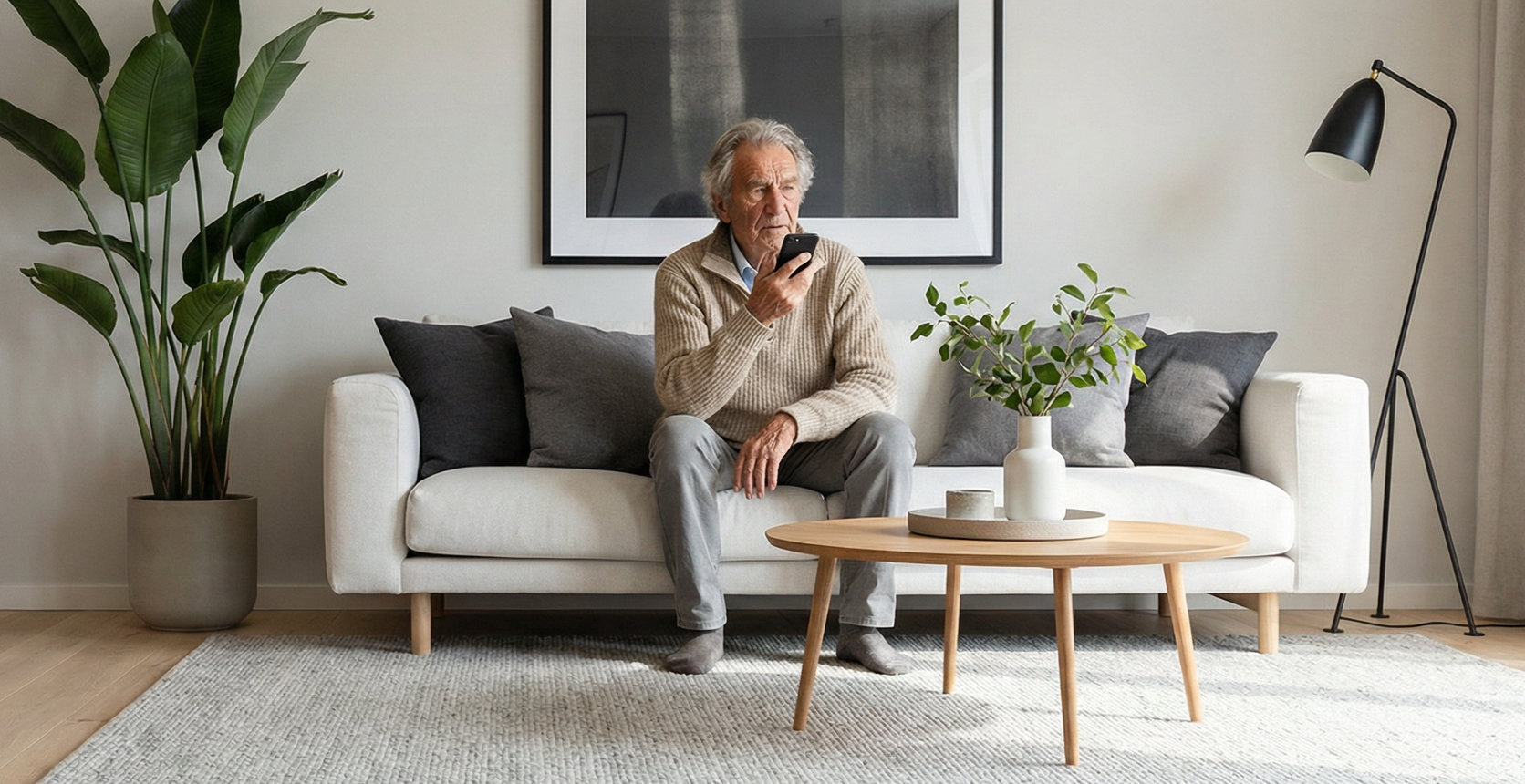
Imagine standing in front of a door, but the handle is mounted too high. You know how to open a door, but the design excludes you. That’s exactly how the digital world feels to millions of older adults. In an aging society, accessible design is no longer a niche concern—it’s a necessity. It’s not just about larger fonts—it’s about participation, health, and respect for changing perceptions.
We are facing a demographic shift: the global population is aging rapidly. By 2050, the number of people over 65 worldwide will nearly double. But while we are living longer thanks to medical advances, our digital environment is lagging behind. Apps and websites are often developed by young people for young people—packed with complex gestures, low contrast, and hidden menus.
Good design for older adults means understanding the biological and psychological realities of aging and radically simplifying things. After all, technology should ultimately be as reliable and simple as a light switch or a good old hammer.
1. Biology Meets Interface:
A View Through the Yellow Lens
Anyone designing for older adults must understand how the senses change. The most obvious challenge is vision.
The phenomenon of lens yellowing
As we age, the lens of the human eye loses elasticity and clarity. It becomes increasingly yellowed. This acts like a natural yellow filter that alters the perception of colors. Short-wavelength light (blue, violet) is absorbed more strongly. As a result, subtle shades between blue and green or violet and gray often can no longer be distinguished. Colors appear “dirtier” or darker.
The Design Answer: Contrast Is Key
Many designers respond by making everything colorful and garish. But the more elegant solution lies not in color alone, but in luminance.
• High contrast: To ensure readability, the contrast ratio between text and background must be significantly increased. The Web Content Accessibility Guidelines (WCAG) often recommend ratios that exceed the standard (e.g., 7:1) for older users.
• Color as an anchor: Colors like blue convey calm and trust. To make them visible to older eyes, they must be deep and rich and paired with bright white. It’s all about clarity: Text must not just sit against the background; it must “stand out” from it.
2. Motor Skills and Anxiety:
Why “Tapping” Is Better Than “Swiping”
In addition to vision, fine motor skills often decline with age. Hands may tremble, and sensitivity in the fingertips may decrease. This makes using modern touchscreens a challenge.
No complex gestures
Modern user interfaces often rely on swiping gestures or pinching to zoom. For older users, these movements are often physically challenging and cognitively unintuitive.
• The solution: Simple tapping. Every interaction should be based on a clear, unambiguous touch. Buttons must be large enough (at least 48 pixels) and spaced far enough apart to prevent accidental taps.
"Safe Exit"
Many older people use digital devices with a lingering fear: the fear of “breaking” something or getting stuck in a situation they can’t get out of.
• The solution: An app shouldn’t test the user—it should keep them engaged. A “Back” or “Home” button that’s always visible acts as a digital anchor. It provides the reassurance that any mistake can be corrected immediately. This eliminates fear and encourages curiosity.
3. The Voice: The World's Most Natural Interface
As eyesight and dexterity decline, one tool often remains effective: the voice. Voice-based systems (voice assistants) are becoming increasingly popular among older adults because they bypass the barriers associated with traditional controls (keyboard, mouse, touchscreen). Speech is intuitive; it does not require learning abstract menu structures.
• Social connection: Studies show that voice assistants are often perceived not just as tools, but as social companions. For people who spend a lot of time alone, a voice in the room—even an artificial one—can help alleviate feelings of isolation.
• Design principle: Ideally, technology should become invisible. An interface that listens and responds, rather than one that needs to be operated, embodies the concept of “Simplicity is Care.”
4. More Than Just Usability: Design Against Silence
Why is this issue so urgent? Because poor design doesn’t just cause frustration—it isolates people. Social isolation and loneliness in old age pose serious health risks. Chronic loneliness has been linked to a significantly increased risk of cardiovascular disease, stroke, and dementia. It is as harmful as smoking 15 cigarettes a day.
When we design digital products that exclude older adults, we’re building walls. When we design them to be inclusive, we’re building bridges. Digital inclusion means social inclusion. A video call with grandchildren or a voice command that plays music can mean the difference between a day spent in silence and a day spent connected.
Conclusion: The curb ramp effect
People often worry that design for seniors makes products “boring.” The opposite is true. We call this the curb cut effect: curbs were originally built for wheelchair users, but today they are appreciated by parents with strollers, cyclists, and delivery drivers alike.
The same applies to digital design:
• High contrast helps us all when we use our cell phones in direct sunlight.
• Voice control comes in handy when we don't have a free hand while cooking.
• Simple meals are helpful when we're tired or stressed.
Good design is the absence of fear and the presence of trust. When we design technology to enrich the lives of older adults, we are shaping a better future for all of us.